Wednesday, December 16, 2009
A study in contrasts
I call it "Juanita (95), Catherine (14)." Seems subtler than calling it "Old Age and Youth."
This is a rare instance of a photo that I ran through Photoshop. In the original, the blank wall on the left takes up something closer to 60% of the width of the shot, in other words, there's more white space between the nonagenarian and the teenager. I simply removed a small amount of the blank white space in order to make the two halves of the photo more nearly balanced. Does this slight editing - removal of empty space - mean that the resulting photo has been "made" and not "taken"? There's a line somewhere, that separates corrective processing from creative editing. The small change I made here might be close to that line, but I don't think it crosses it.
Thursday, December 10, 2009
Have you seen this kitten?
The next day, she didn't return in the morning, so I made a flyer to distribute in the neighborhood. I have a number of photos of her, but I picked a photo of her and Catherine. It's a satisfactory photo as a description of Kiki: You can see that she's a black kitten with white on her face and chest. But I chose this photo especially because it has Catherine in it. Most lost animal flyers show only the animal. I thought it would get people's attention to show them that this kitten is dearly loved and missed by a young girl.
Friday, December 4, 2009
The blog's new web address
http://blog.william-porter.net
You might want to update your bookmark!
Thursday, December 3, 2009
Body Double
This is a pretty old practice, especially for news and sports photographers, going back at least to the early days of the single-lens reflex camera. If you can find old news or sports photos that include photographers in them, you'll see this. For example, in Hans-Michael Koetzle's terrific book, Photo Icons, volume 2, there's a photo by a great German news photographer Barbara Klemm, showing Leonid Brezhnev (Soviet Communist Party Chair at the time) meeting German Chancellor Willy Brandt in Bonn. The photo mainly shows the principals and their translators and advisors huddled together to negotiate. But in the near background, there's another photographer, shooting the back of Brezhnev's head. He's holding one Nikon with what appears to be a wide lens, and he has two other Nikons hanging around his neck, one of which has a telephoto lens.
I found Klemm's image on the Web. (Google Images never ceases to amaze.) Notice the photographer in the back on the left.
Anyway, carrying two or more bodies is still common, or at least not uncommon. I routinely carry two cameras with me, and sometimes three. This was true when I was working an event in the past, where I'd carry a wide, fast zoom on one camera and a tele, fast mid-range or longer-range zoom on the other. Now that I work mostly with primes, I carry more than one camera even more than I used to, because I would prefer not to change lenses. For example, I might carry the K10D with a Sigma 28 f/1.8 and the K20D with (perhaps) the Pentax 70 f/2.4. This gives me a choice of focal lengths, which is exactly what the old news photographers wanted when they carried more than one body.
Carrying more than one body also means that I'm less likely to be stopped cold by equipment failure. If one camera were to fail - and it has happened - I have the other camera right there, in my hand or at least around my neck, turned on and working. I can't apologize to the couple and the minister and ask them to pause the wedding ceremony for one minute while I get the backup out of my bag!
(This post is a revised version of a reply that originally appeared in the pentaxforums.com discussion site.)
Tuesday, November 10, 2009
Crop rotation
To crop, or not to crop?
It's not an easy matter to decide.On a purely practical level, anybody who sells prints to clients as I do, has to accept the fact that clients have their own ideas about print and frame sizes. The sensors in all of my Pentax cameras have an aspect ratio of 2/3, that is, the short side of the sensor and thus of the resulting image is 2/3 as long as the long side. If I put the photo online with its original aspect ratio, it will print nicely at (say) 4" x 6" or 8" x 12". Unfortunately, a client might want a 5" x 7" print because that's the size frame she's got to fill. If I filled my viewfinder perfectly when I composed the shot, cropping to 5" x 7" might require doing violence to the image, like chopping off the top of somebody's head. When I'm shooting for clients, I make an effort to capture a little more than I think ideal to frame the photo, precisely to provide cropping room to accommodate different aspect ratios.
On the other hand, most images do have a "right" aspect ratio. At least I think that's the case. And unfortunately it's not always 2/3. Especially when I'm shooting for myself, I will crop the picture in post-processing in the way that seems right to me. For a shot of the Grand Canyon, that might mean an aspect ratio of 1/3 or even wider. Occasionally, 1x1 seems right. But the right aspect ratio isn't always obvious, even after I review the photo on my computer.
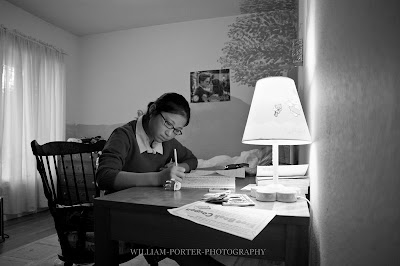
Catherine studying
Walking down the hall this afternoon, I peeked into Catherine's room and saw her studying, and I could see at a glance that it would make an interesting photo. So I grabbed the camera, came back, and as politely and unobtrusively as possible, I squatted down and took two quick shots. The shot above is what the camera saw, at its native aspect ratio of 2/3.I rather like the photo just the way I took it. But as I was making the black and white conversion in Adobe Lightroom 3 beta, I began to wonder if all that blank wall on the right side of the photo was good. Or rather, I began to suspect that it was accidental, just wasted space that was there because of my vantage point. So I cropped it out:
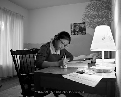
That's okay, I said to myself, but for some reason it seems rather boring now, a mere snapshot, when the scene that I was pretty sure I saw had struck me as more interesting. You see, once you actually look at the photo, it's often hard to remember what you were thinking of when you took it. Actually, I quite frequently ask myself, "What the hell was I thinking of when I took this photo?"
Anyway, at this point, I was starting to guess. And I guessed that the problem now was that there was too much of the ceiling in the upper background. So I cropped that out too:
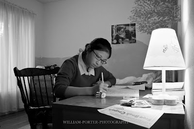
But that was clearly going in the wrong direction. So I went back to the original photo and thought about it for a few seconds more. And a lightbult went off in my head. The blank wall on the right was important to the photo, because it very nicely balances the wall and the curtained window on the left. But there was extraneous stuff above and below the interesting horizontal center area of the photo. So I changed my crop ratio to 1/3, et voila!
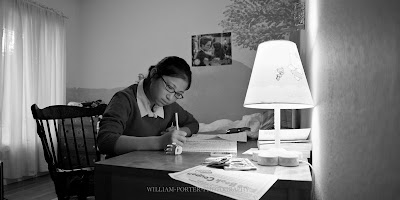
That is the picture I saw initially, the picture I meant to take. At least, I think so. It's better than the previous two crops. I think it's an improvement over the original photo, too, but I'm less sure of that. Unfortunately, it's going to be a pain to print and frame!
The right crop for every photo
I do believe that there is a "right" aspect ratio for every photo, and it's not always 2/3. But if the picture needs cropping, the right crop isn't necessarily a nice clean ratio of even numbers like 2/3, 4/6 or 5/7. Still, I stick to the simple ratios, because they print the best. It's part of the compositional challenge.Monday, November 2, 2009
Orb weaver
Monday, October 26, 2009
Lightroom 3
 |
| From 20091026 rainy day |
It's all in the eyes
Thursday, September 3, 2009
Funny Photos
Well, National Geographic has just posted the funniest picture I've seen in a long time:
While the couple tried to take a picture of themselves, a squirrel heard the camera beeping and walked over to investigate. Auto-focus was drawn to the squirrel, and that was that. Click the picture to read more about it.
*
Why aren't there more funny photos? If there were a secret to taking funny photos, I'd love to know it, because I bet there's money in it!
It's too easy to say that humor is mostly verbal. There may be a lot of truth to that, but it's not enough. Occasionally the newspaper funnies are actually funny, and sometimes, they can be funny even without words. Berke Breathed's Bill the Cat is funny plain and simple. And the great silent movies of Chaplin and Keaton can be hilarious.
Does humor require narrative? The cheeky squirrel photo is funny at first glance, but even funnier if you think about it for two seconds until you "get it," that is, until you reconstruct in your head what must have happened. There certainly are photos that show the "after" state but imply the "before," so you can infer from them a brief sequence of events. I can't think of a good example off the top of my head but I know they're out there.
Adams mentions incongruity as an element in humor. An arrogant dandy in a three piece suit who slips on a banana is funny. A poor old grandmother who slips and falls is an object of pity. Adams also suggests that it's important that the subject in the photo be aware that they are part of a joke, but I am sure that can't be right all the time. A photo of a cat who falling into the toilet bowl head first will be funny to us, although the cat doesn't know it's part of the joke and if it did, it would not consider the joke funny or, for that matter, in good taste.
*
I suspect the main problem is that real life simply doesn't contain many moments of purely visual humor. Real life is crazy funny but it's not usually funny just to look at. I don't think I'm just not looking hard enough, although if you have to look hard, that pretty much proves my point. The humor in life usually does come from events that have a narrative structure - this person was in that situation expecting this other thing to happen, and then something unexpected happened instead. And these narratives are hard to compress into a single scene. (Note that I'm not denying the possibility of a humorous sequence of photos. But here I'm talking about "normal" photos taken singly.)
I can think very quickly of a hundred funny stories about things that have happened to me, or to me and my wife. But the only one I can think of that would have made a pretty good picture, goes back to when one of our daughters was in middle school in Houston. She was part of a school dance pageant. One of the acts involved a group of very young (first grade?) Mexican-American children dancing in traditional dress - girls wearing big flouncy skirts, boys wearing charro suits and sombreros. Well, it became apparent to the audience fairly early into their number that one boy was having a problem with his pants. His belt was too loose. He hiked his pants up whenever he had a chance but this was difficult because the dancing requires that he frequently hold hands with his partner, a girl, so his pants kept sliding down. By the middle of the number, the audience was laughing openly. Somehow the boy kept his pants on...until the end of the dance. When the final chords were being played, it became clear to the audience that the girls were going to jump into the arms of the boys. The boy had a decision to make. To lift the girl up he was going to have to use both of his hands. He made the right decision: he caught his girl. And his pants finally fell all the way to the floor. That would have made a very funny picture, because I think the viewer would have been able to fill in the rest of this narrative. Still, something a photo cannot do at all is create suspense, and that was one of the most suspenseful things I've ever seen. When the boy caught the girl, the audience erupted in laughter - and leapt to its feet to applaud the gallant young man. The photo would have been funny, but the event as it happened was hilarious.
*
There's not a lot of humor in purely instrumental music, either, by the way.
Tuesday, September 1, 2009
FlashWave 2 radio triggering system
Want to take better flash photographs? There are lots of things you can do, but the basic idea for most of them is to get the flash coming from some direction other than the direction of the camera's lens.
The easiest way to do this is to abandon the camera's built-in flash in favor of a removable hot-shoe flash unit (sometimes called a strobe). You can improve things more by learning to bounce the light from the hot-shoe unit. Even better, if you have a camera that supports optical wireless control of remote flash units, you can get the flash units off the camera completely. But controlling remote flash units with optical triggering is not completely reliable and the slave flash units have to be placed where they can see a strong signal from the control flash on the camera. You can't place optically controlled flashes completely out of sight of the controller, like, for example, behind a screen or around a corner. Optical triggering doesn't suck, by any means. If it works in a given situation, it's easy to use and it's basically free, or it is for me, because my Pentax cameras and my Pentax and Metz flash units all support it. But when it doesn't work well--which is a lot of the time--then it's
So most serious flash photographers use radio controlled flash. The idea here is that you attach a small transmitter to the camera, usually by mounting it where you would normally mount a flash unit. And you attach your remote flash units to receivers. When you click the camera's shutter, an electric signal is sent through the hot shoe. This would normally trigger a hot-shoe mounted flash, but when you have a radio transmitter mounted instead of a flash, the transmitter sends out a signal to its receivers, and they in turn trigger the flash units.
I'm working with FlashWave 2 units from G9Chron. They were recommended by some friends on the Pentax Forums list. They are a lot more economically priced than, say, Pocket Wizards, but they are reputed to be very reliable and easy to use. One advantage is that the FlashWave units come with built-in hot shoe adapters. This matters to me because my Pentax and Metz flash units don't have the ports necessary to connect to the FlashWave receivers via cable. And even if they did, hot shoe is much easier. If you're going to go wireless, why not go all the way?
Here's a simple photo that gives a basic idea of what's so neat about radio triggers.

This photo was taken with my Pentax K20D and one (just one) NIKON SB-18 Speedlight, a FlashWave 2 transmitter on the camera and a FlashWave 2 receiver attached to the Speedlight.
Note that the flash is down the hallway and around the corner. It is, in fact, around the corner and about 8 ft to the left. I could not use optical triggering with the flash placed like this: the triggering preflash would not make it to the remote unit.
I would also like to emphasize how neat it is to be able to use a Nikon flash with my Pentax camera. The radio triggering system doesn't care whether the flashes it's triggering are one brand or another, so I can use this little old Nikon flash (which I bought used for a few dollars, to use with my old Nikon N65 film SLR) even though I am not using a Nikon camera. Of course, I can also use my Pentax-compatible Metz 58 AF-1 or my Pentax 540FGZ units, but if triggering is handled by FlashWave 2's radio signalling, then it doesn't matter that these units are Pentax compatible. They're just flashes.
I'm quite pleased with the FlashWave 2. It's been 100% reliable for me. I thought it had failed to fire on me once, for a second or two, until I realized I hadn't turned the receiver on. Duh. The units are well made. Set up was child's play. Transmitter and receivers came with batteries and already set to the same channel. All I had to do was attach the units to the camera and flash units respectively and shoot.
If you're used to shooting flash with your camera's auto-exposure system (called P-TTL on Pentax systems), you'll have to learn how to control the flash output manually. This is easier than it seems. Actually, in this photo, there was nothing to do at all, because the SB-18 is so simple it does not have any controls. When I did an earlier version of this shot with the Metz 58 AF-1, I set it to 1/4 power and that was about right.
If you do check out the FlashWave units, be aware that G9Chon currently sells two products: the FlashWave 2 radio triggers, which have been around for a little while, and a newer product called FW-1B. The FW-1B is not a FlashWave. It's less expensive than the FlashWave 2, but it's also less powerful (so it's designed mainly for use in small studio environments) and it doesn't come with the built-in hot shoe adapters, so with my flash units, at least, I'd need to pay extra to buy adapters separately. I have not tried the FW-1B. But I can certainly recommend the FlashWave 2.
*
Post scripta.
Couple things I forgot to mention earlier. First, if you know little about off-camera flash photography and would like to learn more, The Place To Go on the Web is http://strobist.com. And once you start getting the hang of it, you might then like to read Joe McNally's latest book, The Hot-Shoe Diaries. This guy's one of my heros.Thursday, March 26, 2009
Pentax K20D high ISO performance
Nikon's newer - and much, much more expensive - full-frame cameras can do even better than the K20D, even at higher ISOs. From what I've read, I gather that ISO 6400 on a Nikon D3 resembles what you get at ISO 1600 on a Pentax K20D - a full two-stop difference. That's nice. But I don't need a Nikon D3 and don't want to pay through the nose for one. If I were a millionaire, I might. If I were shooting magazine covers, I might - although it's even more likely that I'd be shooting medium-format and getting even less noise than the D3.
There's always a compromise. There is no compact full-frame digital camera that shoots without making a sound and returns virtually noiseless photos at, say, ISO 6400. Every camera involves a compromise. You want lower noise? You pay for it by buying a camera with a larger sensor. Compact cameras like my old Canon PowerShot S5 can take truly wonderful photographs, but they're simply not designed to deal with extreme exposure challenges. That's not a liability, it's a compromise. The compact cameras are smaller, quieter, and cost less than either APS-C sized or full-frame digital SLRs. You want even lower noise than you get from a K20D? The Canon 5D (full frame) is still available but getting a bit long in the tooth; the newer Nikon full-frame cameras are nice but really expensive.
I don't want a perfect camera. Well, I want one, but it doesn't exist. So I compromise. What can I afford? And what will do a good enough job for me? To be honest, if I could make just one change to the Pentax K20D and it was either (a) fantastic performance at ISO 6400 or (b) a noiseless shutter, I'd go for (b).
And the K20D's performance at higher ISOs is stunningly good, if you use a reasonable, historical baseline for comparison. Here for example, is a shot taken at ISO 6400, with in-camera noise reduction set to "high".
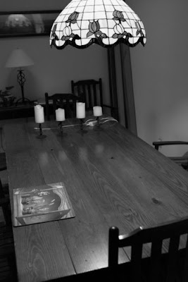
It's hard to tell from this photo, but trust me, it's not bad at all. If for some reason you were motivated to waste paper on this boring photo, it would produce a nice print at normal print sizes like 4"x6", 5"x7", perhaps even larger. You can click on the picture to view a few photos from the same brief test.
Like most of my tests, the test shots I took this morning of my dining room table don't prove a lot, except that ISO 6400 on the K20D can actually produce a usable image, in the right circumstances. Unfortunately, I do know that the results I've gotten at high ISOs - that is, shooting at sensitivity levels higher than about 800 - is quite variable. I cannot entirely explain the factors that make a difference here, but I've take shots at ISO 1600 that are much noisier than this shot taken at 6400. The amount of light seems to matter, and so does the quality of light. The nature of the objects being photographed matters a lot. Objects with some variation in them seem to show noise less than areas of the photo with little variation, like walls or large shadowy areas. If I do get an irresistible desire to start photographing blank walls in the dark, I'll look into the Nikon D3X. But for now, my K20D meets these challenges satisfactorily. And when the light is decent, which is most of the time, the results I get are, as a practical matter, every bit as good as those I'd get from a full-frame camera.
William Porter Photography's new (old) blog
I want to say up front that, while I do not expect to post here any more frequently than I used to, this is still intended to be a real blog, that is, something closer to an online diary than an online personal magazine. I think carefully about what I say online - but I want to be able to post things here that are tentative. In other words, I reserve the right to be wrong!
![William Porter Photography [2009-10]](https://blogger.googleusercontent.com/img/b/R29vZ2xl/AVvXsEivarWsIzJ4UBGkZm5Bhjfzd86M8FVCsnN6XYKbLreeu9ClcuVDhxQ01Et3CzACm0EEmSb8ysiGiONwchtch3c20CgUQJTV0GhZh5C0Bd-1DfUo29rk-UeOlREIxl8OTd1T3kNrMWHre3EV/s1600/GOOGLE+320x132.png)


