Tuesday, June 15, 2010

More about the Panasonic LX3

In my post yesterday I simply shared a few of the photos I've taken with the LX3. I think I should add a little technical info, for anybody who's actually interested in the camera.


Cons


The Panasonic Lumix DMC-LX3 has very few cons. Perhaps the main one right now is that the model itself is a year and a half old. There are rumors about a new model (possibly called LX5) being released later this year. I didn't worry about it. There's always something newer and better ready for release next month.

So what are the LX3's disadvantages?

Well, first, the telephoto end of the camera's zoom range doesn't reach very far—a mere 60mm in 35mm equivalence. If you want to take photographs of birds, well, don't buy the LX3. I wish Panasonic sold a companion camera with a zoom that ran from, oh, 70-300 in 35mm terms. But they don't. I'm happy to have the LX3's superior wide-angle performance. And to be honest, given my experience in recent years shooting with prime (fixed focal length) lenses on my Pentax DSLRs, I find the LX3's modest zoom range easy to live with. Any zoom at all is a novelty to me.

A second and clearer disadvantage is that the LX3 produces rather noisy images at ISOs over about 400. You can find examples of this in all of the reviews of the LX3. I personally don't find this much of a real disadvantage, either, not because I like noisy images, but because this criticism can be thrown at any small-sensor camera. If you want to shoot in really low light and get stellar results, you buy a DSLR, and even there, some are better than others. The LX3 does have a built-in flash that works tolerably well, but I have reconciled myself to the fact that the LX3 isn't going to be taking photos in the dark.

Third disadvantage: no viewfinder. As it comes out of the box, the LX3 expects you to frame photos using its LED screen. The screen is big (3"), bright and high-res (460,000 pixels), but when you shoot in bright sun, using the screen can be difficult. A built-in viewfinder should provide a tiny duplicate of the LED screen that you can put your eye up to and see clearly even in bright sun. A built-in viewfinder would display your current camera settings, and would zoom as you zoom. However, a built-in viewfinder would also make the camera bigger; see the Canon G10 or G11. In keeping with the Rangefinder esthetic of the LX3, Panasonic decided to release instead, as an add-on, an external optical viewfinder (EOV). The EOV allows you to frame your photo, somewhat approximately, while you hold the camera to your eye. Holding the camera to your eye is a more stable way to hold the camera; and it also eliminates the problem of viewing the LED in bright sun. The drawback of the EOV is that it doesn't communicate with the camera in any way, so you don't get a TTL (through-the-lens) view before you take your photo. Guidelines on the EOV's viewing screen show you the dimensions of a photo with the 3x2 aspect ratio, which is just one of the three aspect ratios at which the LX3 can shoot. So if you are trying to frame your shot with absolute precision, well, you might want to turn on the display screen. But I've found that it's possible to do a pretty good job framing shots with the EOV. And turning off the LED dramatically reduces battery consumption.

Those are the only significant disadvantages or cons that I can think of.


Pros


The LX3 has too many advantages for me to list them all. Here are a few that matter to me.

  1. Optically outstanding Leica lens, with a wonderful wide-angle reach of 24mm (in 35mm film SLR terms) and a max aperture of f/2 to f/2.8. In a sense, the LX3 is what any serious photographer wants: a terrific lens, with a camera attached.
  2. The LX3 supports raw capture. Actually, this was one of the main things that drew me to the camera, but the more I shoot with it, and considering that I'm using it only for personal photos rather than for work for clients, the more I'm leaning towards shooting jpeg in the camera. Still, I'm happy to know that the raw capability is there if I want it.
  3. The LX3 gives me the ability to control just about everything, indeed, the number of options and controls is a bit bewildering at first, even to someone used to working with a pro DSLR. The LX3 does have the standard PASM exposure modes (program, aperture-priority, shutter-priority, and full manual). P has a program-shift feature that resembles the K20D's hyper-program feature, so in a way, you don't need A or S at all. What I'm discovering, however, is that the camera is smart enough that I can put it into P mode and just shoot.
  4. The big, high-res LED is even better than the displays on my DSLRs, and I'm still enjoying how good pictures look on the back of the camera.
  5. I can focus manually if I need to.
  6. Amazing close-focus (macro) capability. The LX3 can focus from 1 cm. And here the LX3's small sensor provides an advantage over shooting with my DSLRs and the excellent macro lenses I have: at a given focal distance, smaller sensors yield greater depth of field.
  7. The LX3 has the rare ability to shoot at multiple aspect ratios, while maximizing the use of the sensor and at the same time maintaining the same angle of view on the scene. It took me a while (and a little calculating) to realize how interesting an achievement this is. The LX3 doesn't just crop, or perhaps it would be more correct to say that it crops all three of the basic aspect ratios (4:3, 3:2 and 16:9). As of firmware version 2.1, the LX3 can also take a 1:1 aspect ratio shot.
  8. The LX3 has an internal buffer that can be used to store a couple of photos. This is brilliant. A month or two I grabbed a camera and ran to the lake to photograph a gorgeous rainbow. Jumped out of the car, framed my shot—and then realized that the camera didn't have a card in it. If I'd grabbed the LX3, I would have been able to take the shot anyway.
  9. Build quality. The LX3 is a nice piece of work that feels like a serious, old-fashioned camera. A lot of other cameras sold these days, including some that are expensive and take very good photos, feel like cheap toys by comparison.
There are literally dozens of other little things about the LX3 that I'm discovering and coming to like very much, like the intelligent ISO feature, video capture (which I don't use much but am grateful to have), and voice annotations.

In a nutshell

In short, the LX3 has a terrific lens, is a pleasure to shoot with, and yet is going to keep challenging me, because I know that, if I take a lousy photo with the LX3, I can't blame it on the camera.

The Panasonic LX3: The perfect personal camera (for me)?

I haven't shot with a fixed-lens, compact camera for about five years. But recently I decided I wanted a camera compact enough to go everywhere with me, comfortably. The only problem was that the camera also had to take truly outstanding pictures. My research and testing led me to the Panasonic Lumix DMC-LX3. I've been putting it through its paces lately and I'm impressed with what this little camera can do.


Double-wide

One of the most remarkable of the many remarkable features of the LX3 is that the lens, an optical gem made by Leica, goes wider than just about any other compact camera: to 24mm in 35mm film equivalence. At the telephoto end of the lens's zoom range, it only goes to 60mm, which isn't much of a telephoto at all. In short, this is a camera made to go wide, very wide.

This makes it perfect for working inside.


Or outside, in the wide-open spaces.


I used to think that telephoto reach was what I wanted most from a camera. I've changed my mind. Now I want everything double-wide, and the LX3 delivers.


Up close

The LX3 also lets me get close, really close. It's a good thing that my model here (Beebe the guinea pig) and I are on pretty good terms.


Wide and close can be nice. I was only an inch or two from this flower:


Although sometimes, simply very close is all that's needed. This was taken from less than an inch away:


Raw or jpeg?

I've been a raw evangelist for a while. "Raw" capture is what every digital camera's sensor does. When photographers say they "shoot raw," they mean that they like to save all of the data seen by the sensor, so they can work with it on their computers later. The LX3 supports raw capture, and indeed, that was one of the reasons I bought it. (Most compact cameras do not.)

But I've discovered that the LX3's in-camera conversion of raw data to jpeg format is outstanding, and although it seems like heresy for me to say this, I'm tempted to start shooting jpeg with this camera. I spend too much time processing photos for clients. I'd be happy not to spend so much time processing my own photos. This picture was created by the camera's built-in jpeg procesing engine and it's indistinguishable from the jpeg that I created myself in Adobe Lightroom 3 from the raw file:


The perfect personal camera (for me)

In short, the LX3 seems to be the perfect personal camera, at least for a wide-angle photographer like me. The Panasonic wide-angle conversion lens, available as an add-on for the LX3, takes the camera to an amazing ultra-wide angle focal length of 18mm (in 35mm film camera terms), and I think I'll find a use for that focal length when we go to Yellowstone National Park later this year. In fact, I think I'm going to leave my Pentax DSLRs and all my lenses at home and rely on the LX3. I'm confident it can do the job.

*

Postscript 6-15-2010: For details on what I like most about the LX3, see my next post, here.

Monday, May 24, 2010

What people like, face to face

Last Sunday (May 23, 2010) I had the pleasure of spending the afternoon sitting in a beautiful garden and talking for most of the day to strangers about a few of my photos. I was there as part of the East Dallas Gardens and Artisans Tour. My wife and I have been going to these art fairs for as long as we can remember, but this was the first time I'd taken part in one myself as an "artist" or exhibiter or (as I would prefer) a craftsman. And it was a treat.

In this post, I simply want to comment on a few of the photos that I was showing that day. If you came by, you will already have heard some of this from me in person.

The Grand Canyon photos

I was quite sure that people would comment on this photo, taken at the start of our hike down into the Grand Canyon last December.

Bright Angel Trailhead, South Rime, Grand Canyon, December 22, 2009

I expected it to get comments in good part because I'd made a large (20" x 30") print and had it beautifully custom framed by Decor Art & Frame on Greenville in Dallas. Frames matter! But I'm proud of the photo. Most of my Grand Canyon photos look like everybody else's. It's hard to take a striking photo of a cliche. But we had the good fortune (as well as the challenge) to be hiking down the Bright Angel Trail last December during a fairly significant snow storm. And this gave me a view of the canyon that, while not unique, isn't very common, either. I was happy to get the Kolb Brothers historic photographic studio into the photo. For the same reason, I've always been fond of this photo, taken five years ago from the North Rim of the Grand Canyon, on a day when clouds had settled into the canyon:

Grand Canyon from the North Rim, with clouds

If you want good photos of a popular place like the Grand Canyon, one way to increase your chance of success is to keep going back.

White Rock Lake

In my tour display the other day, I also included a couple of my favorite photos of White Rock Lake. I had a couple of the Mockingbird Lane foot bridge. One in the fog, taken with an ultra-wide angle lens:


And another, one of my favorites, taken with a telephoto lens and from a slightly different vantage point, during a rare snowstorm in Dallas (February 11, 2010):

Mockingbird Lane foot bridge over White Rock Lake, in the snow, February 11, 2010

I think it's interesting to compare the photo above, with this photo that was taken just about the same time:


I like this second photo, too. I like having the jogger in the photo, for scale and also for color. Wish that the car was missing, though. And this second photo has too much going on: the tree, the jogger, the car, the snow. The first photo is, well, simpler: it's a picture of a bridge in a snowstorm. There's a tree in it, too, but the tree is way off to the side and not really part of the "subject." I mean, if you are going to photograph a tree, photograph a tree, like this:


Or this, from the Dallas Arboretum:


Of the photos of White Rock Lake in the snow last February, next to the bridge photo (above), this was probably the most popular photo among my visitors:


That's Lake Highlands Drive, just east of the Bath House on the east side of the lake. Actually, I was taking a photo of the Bath House and the lake, and I wasn't happy. Then I realized why: the lake didn't have snow on it. I turned to the left, and got the photo above. Maybe we have a special appreciation for the beauty of snow here in Dallas. We don't see much of it.

People liked the photos of the lake in the fog, too, including this photo of the old boat house near T. & P. Hill:


And this picture of the boats at the Corinthian Sailing Club:


That photo, like the photo of the bridge in the snow, was not "Photoshopped." Fog is a wonderful artistic filter.

My favorites

Perhaps my favorite, of the photos I displayed last Sunday, is this photo that I took several years ago of my dog Abby running in our back yard:


The technique here is simple: pan the camera sideways to follow the movement of the subject. The background inevitably blurs. Here, it produces a very painterly image.

Kids liked the running dog. But this seemed to be the favorite photo of many of my adult visitors:


Many people assumed it was two photos, stitched or "Photoshopped" together. Nope. That's my mother-in-law on the left, and my daughter on the right, and the photo was taken at my dinner table. I looked up from dinner, saw the photo, and snapped the shot. That white, blank wall behind my mother-in-law really is that white, blank and lonely. And behind my background there really is a shelf with dishes, a hallway with a photo, and a bedroom door. But of course what really make the photo is, first, my mother-in-law's expression. She's not actually unhappy. She just doesn't want to expend the effort to smile. And the second key element is my daughter's hat. Yep, that's what she wore to dinner. What can I say? It was a new hat.

What's the lesson here, boys and girls? Keep the camera with you, even at the dinner table. You just never know...

Friday, April 9, 2010

HCB at the MoMA in NYC

I don't usually say to myself, "Gee, I wish I could go to New York City." I'm more likely to sit back and thank God that I'm here in Texas. But today I'm wishing I could hop a plane to NYC, having just learned about the MoMA's new show featuring the works of Henri Cartier-Bresson.

http://moma.org/interactives/exhibitions/2010/henricartierbresson/#/

The link provides a slideshow with a generous sample of images. 

HCB (as he so often referred to by photographers) is the Picasso of photography in the first half of the twentieth century—that is, the dominant figure, the genius everybody who knows even a little about photography thinks of first when trying to think of a "great" photographer. 


And genius he surely was. Like all of the great photographers I really admire, Cartier-Bresson inspires me to admire his eye and his imagination rather than his technical prowess. I don't ask myself, "What f-stop did he use for this photo?" Instead I ask myself, "How did he manage to put himself in position to photograph this extraordinary moment? How did he see it coming? If he arranged it, how was he able to imagine this image—and how did he manage to make it look so totally spontaneous?" 


Occasionally, I put myself in a great spot on purpose, and I'm excited (and a little proud of myself) when I do it. I was proud to have hauled my butt out of bed to photograph the lake in the deep fog, and later, in the middle of the blizzard of February 11 (2010). I had the lake to myself, by and large, and I did get some nice photos as a reward. 


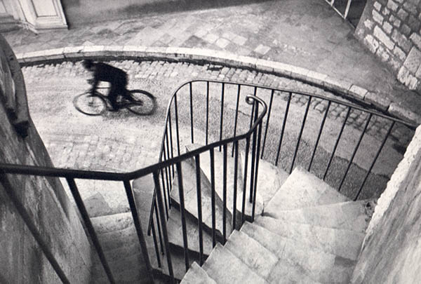
But photographing the lake in a snowstorm is relatively easy—and obvious. Just wait for a snowstorm, then go out with a camera. What's amazing about Cartier-Bresson's images is that they almost always involve people. And people are less easily managed than landscapes. Consider this great image:


Henri Cartier-Bresson: Hyères, France, 1932.
Photo linked from the history of photography blog of Jeff Curto, College of DuPage.


I can imagine myself being fascinated by this staircase, if I somehow managed to put myself at the top of it. But to get the cyclist into the photo, well, of course it seems obvious in retrospect, but trust me, it wasn't. And to get the cyclist going in that direction, and to capture the cyclist in exactly that position—that's perfection or pretty close.

Monday, April 5, 2010

Too much of a good thing

You can have too much of a good thing, and sometimes that good thing is color. I was reminded of this recently when I posted here about my upcoming portrait sessions at the Dallas Arboretum. I included a shot from a previous year, showing a lovely mother and daughter, both red-haired. I felt that the red hair was so striking, it distracted from their faces in a photograph in a way that it wouldn't in real life, and I preferred a duo-tone version of the shot to the color original.


In this post I want to expand on that theme. But this time, I want to talk not about people, who almost always look interesting in black and white, but rather, about flowers and trees. The point I want to make about flowers is that, sometimes, a black and white conversion of photos is actually a more compelling photo.

Color is good, sometimes

Here, for example, is a simple photograph of some flowers at the Dallas Arboretum.


It isn't a great photo, to be sure, but whatever interest it has comes from the combination of color and depth. Converting this image to black and white would kill it.

But consider this photo:


The center of interest here is obviously the great, old tree, which looks like something you might run into if you went on vacation with Frodo the Hobbit. But the power of the tree is diminished by the colors in the photo: by the young, green grass, and the sunny blue sky. The clumps of green grass are particularly problematic. Green really grabs people's attention.

Converted to black and white, the tree really comes into its own:


It is still clear, to anybody who is able to see the details, that it's a bright sunny day. The sky is still bright and only partly cloudy. The young clumps of grass are still popping up from the ground. But the black and white version of the photo emphasizes not just the age of the tree but its gnarled magnificence. The color photo is a nice snapshot of a big old tree. The black and white version is (to my tastes, anyway) a much more striking image.


Taste and interpretation

I'd like to digress for just a second into a couple of points that may strike some as a bit academic.

First, taste. It is true that people's tastes differ. I bring this up because some people simply do not like black and white photos or, for that matter, black and white movies. If you are the sort of person who simply thinks that a black and white photo of flowers is stupid, well, I pity you, because you've shut yourself off from most of the greatest photographs ever taken. But I don't expect I'll be able to persuade you otherwise.

Second, interpretation. You don't have to be terribly clever to make up an interpretation that appears to justify any artistic decision, no matter how wrong-headed. If you didn't like the black and white treatment, you could say that the green grass represents young life, which stands in contrast to the old, dying tree, and that converting to black and white robs the photo of its meaning. But some interpretations are better than others, and some interpretations are just wrong. This photo isn't about the contrast between youth and old age, at least not primarily. It's about the tree by itself. In color, it's a weak picture of a contrast between life and death. In black and white, it's a strong picture of an old tree.

Flowers and color

So perhaps you agree that the tree photo is more impressive in black and white. But surely photos have to be in color, right?

Not always. This is a pretty ordinary snapshot:


I think the main problem with the shot is that the flowers are too colorful. I've tried here to tone them down a bit, and they're still too colorful. You have to visit the Dallas Arboretum and see for yourself: The colors of some of the flowers are so vivid, they're literally almost unbelievable, that is, they don't seem real.

Here is the same photo, converted to black and white:


Conversion to black and white doesn't take an ordinary snapshot and turn it into a masterpiece. It's still an ordinary snapshot, but it's more appealing, subtler, not so loud. With the colors removed, you can see the light. Viewed at a larger size, the subtle shading of the flowers in the bed becomes more pronounced.

Reality vs photography, prose vs poetry

My guess is that about a third of the photos I take are more effective after conversion to black and white, and perhaps another third really need to be in color, with the third in the middle being able to go either way. The third that really need to be in color, are of subjects that simply could not be well photographed back in the days before color photography. The third that really want to be black and white are the subjects that we miss seeing today, because we too often simply fail to think about black and white as an option. It's hard to get black and white film processed anywhere these days, and it's not easy to get good black and white prints made at the usual outlets. And many casual photographers aren't aware there's more to black and white conversion than clicking on the "black and white" button in their software. I know it sounds paradoxical, but I spend at least as much and perhaps more time thinking about color when I do a black and white conversion, than I do if I leave a photo in color the way I shot it. Why? Because in the original photo, red is red, and green is green, and there's no mistaking them. In black and white, however, they may very well be mistaken, and I have to think hard to make sure that adjust the color channels in a way that best represents the contrasts and hues in the shot.

Why does black and white work? Because a photo is not a representation of reality as we really see it, at least not simply. The first fact about any photo is the frame, that is, the photo has a limit, a border, an edge beyond which you, the viewer, are not allowed to see. In reality, there is no limit, no border, no edge. Our peripheral vision is greater than the widest wide-angle lens. And if we want to see more, we simply turn our head a little. The frame of the photo restricts our attention to what is shown, what has been selected by the photographer for attention. In the same way, a black and white conversion, by eliminating color, forces us to view what remains—light, shade, form, texture, depth and focus. I think color photography, because it's more "realistic," tends also to be more prosaic. And black and white photography, when it's done well, because it is more formal and more disciplined, is more poetic.

You miss more than you hit (with a note on Oswald, Ruby, Beers and Jackson)

In baseball, a batting average of over .300 is considered pretty good. What's it mean? It means that, seven times out of every ten chances, you failed. And that's if you're good.

Now, consider that baseball is pretty easy, compared to photography. After all, in baseball, you know when you're at bat, and you know when the pitch is coming. As a photographer, I have no idea when I'm going to see my next photograph. This is true not just now as I sit at my computer and write, but it's true even when I'm working, even when I have the camera to my eye and I'm "at bat," so to speak, and ready to swing. I can miss photos because I don't have a camera, and I can miss photos because I clicked the shutter half a second too soon or too late. Taking candids of my nephew yesterday after Easter dinner, I missed a number of shots that I think would have been good, because Matthew is a year and a half old, constantly on the move, and not generally willing to hold a cute expression long enough for me to focus and react. I was shooting with flash, and I had to wait a second or two between shots for my batteries to recycle. Them's the breaks.

Who shot Oswald?

This truth—you miss more than you hit—applies even to famous photographers, perhaps especially to famous photographers. I'm reminded of it today by a post today at Mike Johnson's The Online Photographer blog. The post is actually a link to an article by Michael Granberry at the Dallas News. The article was written in 2004, but Mike Johnston thought of it today and decided to repost it. I recommend you read Granberry's article, and visit The Online Photographer, too, because Mike Johnston posts the photos.

Here's the gist. In November, 1963, on the day that President Kennedy's assassin, Lee Harvey Oswald, was being transferred from one jail to another, ace photographers for Dallas's two daily newspapers were on the scene, expecting a routine photo-op. Both of them took dramatic photos of a totally unexpected event: the fatal shooting of Oswald by Dallas weirdo Jack Ruby. Here are the two photos.

Ruby shoots Oswald, by Jack Beers

Ruby shoots Oswald, by Robert Jackson

The first image above is Jack Beers' great photo. Beers was the photographer for the Dallas Morning News, and as Oswald was escorted into the garage, Beers was better positioned than his rival from the Dallas Times Herald, Bob Jackson. Beers saw Ruby running forward earlier and reacted faster. In so doing, he got a great shot, showing Ruby with his pistol aimed right at Oswald's heart, in the very act of pulling the trigger. I'm not sure but I think the image as shown here is pretty close to the full frame Beers captured, which is to say that he composed the shot really well.

The second shot above isn't framed as well: you can see the shoulder of someone standing in front of photographer Bob Jackson, who was there representing the Dallas Times Herald. Nevertheless, because he was slower to react, Jackson snapped his shutter at an even more "decisive moment", capturing Oswald's reaction as he is hit by the bullet, as well as the sheriff's surprise at the shooting.

Jackson's photo won the Pulitzer Prize that year. If Jackson's photo hadn't been taken, Beers surely would have won instead.

Them's the breaks.

I was aware of both photos but I had never read this back story and I'm grateful to Mike Johnston for bringing it to my attention. I urge you to read Granberry's entire account over at DallasNews.com, for more about the human angle, in particular.


The moral

The moral of the story is obvious but important. No matter how good you are, or how hard you try, you are going to miss many, many more photographs than you ever take.

I carry a camera with me almost everywhere I go. Yet I miss good photos constantly.

Sometimes I strike out swinging, that is, sometimes I have the camera to my eye and I'm looking in the right direction, but I click the shutter a split-second too early or too late, or even more painfully, I click the shutter at the right instant but the flash didn't fire, or the shot was focused incorrectly. It happens.

But often, I strike out looking, that is, I don't have a camera with me, or I just can't raise it to my eye fast enough. Last fall, while on a bike ride by the lake with my wife, I saw one of the most spectacular sunsets I've ever seen. Uncharacteristically I did not have a camera with me, and there was nothing I could do but stop and admire the remaining couple minutes of the sunset. Another miss that sticks in my mind, is the photo I did not take of a mountain lion crossing the road directly in front of my car. This happened a couple of years ago, at the top of Rocky Mountain National Park. My camera was in my lap, but I was too dumb-struck to grab it and shoot. My wife was with me and saw the mountain lion, too, so I know I didn't imagine it. Apparently we interrupted the mountain lion an instant after it had attacked an elk; we saw the cow elk, agitated and bloodied on the shoulder, running down the road as we continued on our way. We reported the sighting of both animals when we got to a ranger station. The ranger we spoke to had worked in the park for twenty years and never yet seen a mountain lion.

Fortunately, I forget most of my misses pretty quickly and don't lose sleep about them. You have to learn to live with it.

Saturday, March 13, 2010

Photographing kites

My wife and youngest daughter went to the annual Kite Festival in Arlington, Texas, today, with my brother-in-law, his wife and their daughter. Of course, I took a few photos. I don't think I've ever photographed kites flying before. It's harder than it looks.

Think about it. What's the photo here, that is, what will you be trying to include in the frame? The easiest and perhaps safest photo, is one of the kite in the hands of the person who is about to fly it. No problems of scale or perspective here.


But the thing about kites is that they go up into the air. Now, as photographic subjects, kites are more like hot-air balloons than, say, birds. But, again, as photographic subjects, kites differ from hot-air balloons in several ways. For starters, kites are much smaller than balloons. A hot-air balloon in the sky may still be a pretty good-sized target. I was shooting with a Pentax 18-250 zoom lens, but even at 250mm (=357mm full-frame equivalent), it's hard to get a kite to fill the frame, after it's in the air. And worse, it's hard sometimes to guess the size of a kite in the air. A hot-air balloon has a basket with people in it, and you may be able to see the people. So you can tell how big the balloon is and perhaps even how far away it is, just from the size of the basket. Not so easy with a kite. In this picture, the traditional blue kite on the right helps the viewer get a sense of the size of the less-traditional kite on the left.


Another problem with kites, from the photographer's perspective, is that the most interesting thing about the kite is that it is linked to the ground. But the string is hard to see—in the photo above it's barely visible. And it's even harder to show the kite and the ground together. Well, you can do this:


But now both the person and the kite are too small to be recognizable and interesting. You can emphasize the person, and put the kite in the background. But to do this, you probably have to stand behind the person, and people's backs are not so interesting.


And that only works if the kite is low in the air; otherwise, you have to take the following perspective.


I guess that's kind of fun, but, well, remember, the kite is really the thing of interest here and it's nearly invisible. Now that I think of it, the ideal perspective from which to photograph a flying kite, would be from the basket of a hot air balloon floating a little above the kite. Then you could have the kite in the foreground, and the person on the ground in the distance.

I didn't have a hot-air balloon handy. The best I could do was suggest perspective by getting the tops of trees into the photo.


You can't see the strings, but the tree tops establish the connection to earth. I think this was my best shot from the day.


The tree-tops provide perspective, and it was luckily emphasized here by the somewhat narrower depth of field (that is, by the fact that the trees are blurred). It's a bit of luck that you can see the string here (exiting the frame lower right corner). And it also helps that this was one of the more interesting kites in the air today.

Larger images here.